
Posted in February 2017
Simple Tool to Test Legibility in Education Spaces
Education spaces are continuously constructed and upgraded. Sightlines and readability are often taken for granted. Ever the same question occurs out of the many conversations that I have with colleagues in the field: “What should the screen dimensions be for this particular space?”
InfoComm has been publishing standards based on thumbrules and scientific foundations (ANSI/Infocomm 5M-2012). Still a simple tool would be helpful for the need of many. This Readability Tool for Education Spaces is based both on scientific figures and empirical observations, on top of that, it is easy :-).
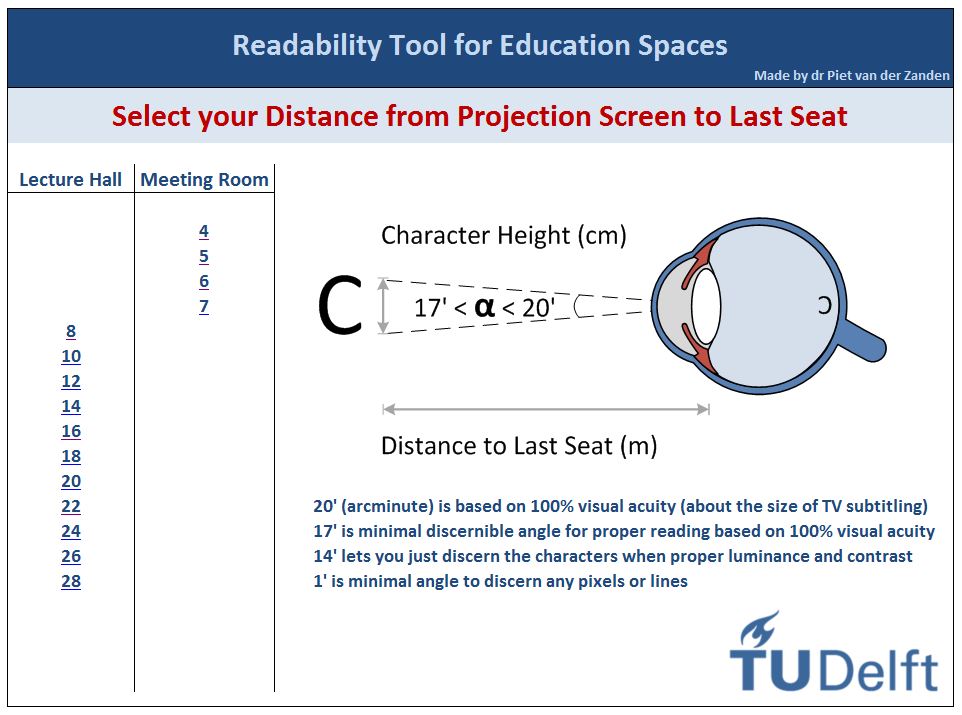 First determine the distance from projection screen to the last row with a laser measuring ruler. Open the tool from your browser, present it full screen and select the regarding distance on the main page. Be aware that the main page contains a list for lecture halls based on projectors and a list specifically for LED displays in meeting rooms. After selection you are guided to an overview page:
- On the selected page the distance in meters is presented in the top left cell
- The top row presents the minimal character height and its related vertical screen height for the room based on the minimum readability angle of 17 arcminutes. Dependent on your situation you have to multiply the screen height by either 4/3, or 16/10, or 16/9, to obtain the screen width. Then look for yourself for the next larger commercial available projection screen
- ‘Angle of view’ shows the different angles 20′, 17′, 14′ and the minimal discernible distance based on 1′
- The font Calibri 11 (default for Excel and Word) is presented with computer generated filler text, in plain and in bold. This is an unfamiliar text on purpose, for you really must read the text and not recognise word patterns
- For each angle (20′, 17′, 14′) the proper legibility distance is given
- The minimum distance for the first row is based on the angle of only 1 arcminute, because from that distance on you cannot discern pixels or lines anymore (based on full HD image of 1920*1080)
- Try to determine for yourself the distance at which you can read the text without difficulty. Compare if your own empirically determined distance corroborates with the given figures
- Repeat the same steps for Calibri 24 (an often used font for PowerPoint)
- Do some more try-outs and become acquainted with the tool
NB: The figures for LED displays are based on 14 arcminutes because legibility is better with high luminance and high contrast. Instead of screen height now the display’s diagonal is given in inches
Recent Comments