
Posts tagged nits
Readability in Classrooms
It should be compulsory that written and presented information in classrooms and lecture halls is easy to produce by the lecturer and easy to read and follow by students. It may be of no difference for readability that written or presented texts are projected on dry eraser boards, on projection screens or on electronic displays. Readability of written and presented characters in lecture halls and classrooms is dependent on sight lines, reading distance, character heights, viewing angles, displays, screens and lighting.
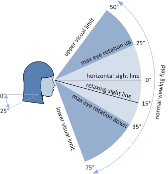
Vertical Viewing Field of the Eye
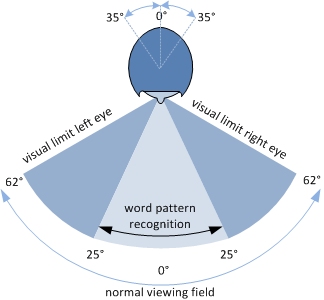
Horizontal Viewing Filed of the Eye
This paper describes guidelines from out of ergonomic, didactic and audio-visual perspectives for an improved readability in lecture halls and classrooms. It ought to be conducive to the building plans used to construct new education spaces or when renovating lecture halls and classrooms.
Readability guidelines:
- Presentation screen’s underside preferably about 140 cm above floor level
- Vertical viewing angle at the first row preferably about 25 degrees
- Horizontal viewing angle at the first row preferably about 35 degrees
- Written and presented character height preferably about 20 arc minutes
- Written characters preferably presented white on a black background
- Projector’s illumination preferably about 1000 lumen per m2 of projection screen
- Projector preferably back projection, prevent hot spot or reflection in case of front projection
- Brightness of LED display preferably 2000 nits or more
- Pixel density of electronic displays preferably larger than 30 PPI
Recent Comments